
How rich you would be if you had bought xyz stocks way back in the past is an often-repeated yet not-very-useful mental exercise. In this article we add a bit of a twist to this trope to see if there are insights to be gleaned, not by cherry-picking a few companies but looking at over 900 companies their earnings, cash-flow and market cap growth over the last decade.
The time-travelling investor
Let’s say you step out of your home after a day of video calls and bump into a contraption with a dial with a date on it. You’ve read enough science fiction to figure out it is a time machine. If we could go back 10 years knowing what we do now, the list of investing to-dos in the past would probably include buying a bucket-load of the HDFC and Bajaj twins. What we’d really want would be to buy a few FAANG stocks but that’s a different story.
There are enough “If you had bought <insert insanely successful stock here> fifteen years ago, then you would be a gazillionaire” articles.
But let’s show a little imagination in our thought experiment. Instead of knowing exactly how any stock has done, assume that you arrive in 2010 with no knowledge of specific stocks but an anonymised list of companies, industries, and their earnings for the next ten years, 2010 to 2020.
You start with information available to you to summarise it in the table below.
Table 1: Industry-wise Cumulative 2010 Market Cap & 2010 Earnings
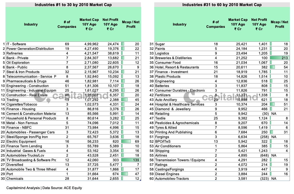
click to enlarge
Table shows the top 60 industries in India by public market cap, as of 2010. This is aggregated data at a company grouped by industries to make it easier to look at top-down.
The number of listed companies in each industry, their cumulative market cap at the time, and latest Annual Net Profit. The final column Market Cap / Net Profit is for perspective.
Note the list includes companies still active as of October 2020. After all your intent is not to invest in companies that will subsequently go bankrupt.
Think of Market Cap / Net Profit as Industry Price-Earnings, a proxy for future expectations of the industry built into valuations. Note how Breweries and Distilleries (rank 34 213x), TV Broadcasting (139x), Electric Equipment (69x) have high multiples. Also the difference between the valuations of Public (9x) and Private Banks (21x).
Why 2010, not 2009, or 2011? No particular reason. We are not cherry-picking a specific year. 10 years feels like a decent window of time we can call long-term.
Now let’s add the time-traveller’s advantage.
Table 2: Earnings growth from 2010 to 2020

click to enlarge
Table above shows the same 60 industries, with the cumulative incremental net profit from 2010 to 2020.
This means, if a company made ₹10 as net profit in 2010. Then made ₹11 in 2011, and ₹12 in 2012.
Its incremental profit for 2011 and 2012 would be (11 – 10) + (12 – 10) = ₹ 3
The final column shows the ratio of this incremental profit over 10 years to net profit in the baseline year, 2010.
Why incremental? One can argue that “absolute” and not “incremental” profits matter, but buying a security for a constant un-changing stream of earnings sounds suspiciously like debt and not equity investing. Add the uncertainty in the earnings and their payout to minority shareholders, and it becomes risky debt.
To be compensated for the risk, equity investors expect at least the probability of increasing earnings.
What do we learn? Over 10 years, IT Services generated 13x incremental profit over its 2010 number. Public Banks made 6x in losses what they made as profit in 2010. So we’d probably stay away from that. Interestingly, Private Banks reported a very similar number as cumulative incremental profit, but on half the starting number.
But nothing comes close to the value destruction in Telecom Services. ₹ 3.2L Crores in losses, that’s $43 Billion at current forex rates. Remember, these are just the still-surviving participants and don’t include those that exit the sector to stop the bleeding.
Back to you in 2010. Do you invest in TV Broadcasting companies (rank 26) who will go on to grow profits by 34x? Or Auto Ancillaries (rank 43) growing earnings by 30x. Or would you stick with the relatively larger sectors of the time, like IT (13x earnings growth) and Pharma (17x earnings growth)?
Assume you pick 2-3 sectors and put in your money into a market-cap or net profit-weighted index of those sectors. How do you think you would have done?
Welcome back time-traveller
Table 3: Comparing Earnings growth to Market Cap Growth

Table compares cumulative incremental net profit and market cap increase over the last 10 years. Market Cap increase is your stock return, > 1x is positive return, < 1x is loss of principal. We’ll get to the 3rd and 4th columns in a bit.
How did your chosen investments do?
The gray-shaded industries had profit declines over 10 years from 2010 to 2020 compared to 2010. e.g. Power Generation made +19,000 Crores in net profit in 2010. Its subsequent profits were nowhere close to that. Deducting 19,000 Crores from each years net profits and aggregating them gives us -32,000 Crores for the industry.
What we can tell
- In general, the market penalises companies that can’t grow earnings. Power Producers and Distributors (2010 Market Cap Rank 2), Steel & Iron Products (7), Sugar Producers (31), Consumer Durables (41). Each of them delivered negative profit growth and as a consequence saw their market caps erode over time
- Conversely, companies (and industries) that have increased earnings saw their valuations grow. IT Services (2010 Market Cap Rank 1), Private Banks (Rank 4), Pharmaceuticals (9). So far so good. This is how you expect the market to behave.
BUT, all earnings, whether growing or shrinking, are not created equal.
- For all the value destruction by Telcom Service Providers (8), industry market cap is still up, albeit marginally compared to 2010. Breweries and Distilleries (34), Hospital & Healthcare Services (44) are two other examples where the market disregarded their lack of incremental profits with 4x valuation growth over 10 years
Here’s an interactive chart showing ten year net profit growth versus market cap growth. Mouse over the individual bubbles to see industry name.
Bubble sizes depict current relative valuation.
Understanding the chart: x-axis is Incremental Earnings over 10 years. So, an axis position of 10 implies the cumulative incremental net profit of the companies in that industry from 2010 to 2020 is 10x of its earnings in 2010. Anything to the left of 0 saw erosion in net profits.
y-axis is the Market Cap growth. Anything below 1 implies declining market cap. So Paints (e.g. Asian Paints, Berger, Akzo Nobel) , Consumer Food (e.g. Britannia, Marico, Avanti Feeds), Household Personal Products (e.g. Hindustan Unilever, Dabur, Godgrej Consumer Products) at the top imply their market caps increased more than that of companies in other industries.
BPO/ITeS, Auto Ancillary delivered higher net profit growth but did not get similar Market Cap growth as Paints and Household Products.
All earnings are indeed not created equal
Here’s another way to look at Table 3. How valuable every ₹ increase in profits was to valuation.
Table 4: Market Cap Growth per Incremental ₹ of Earnings Growth

click to enlarge
e.g. For IT Services, every ₹ in incremental profit was rewarded with ₹5.6 in additional valuation.
How does one make sense of that number?
Think of what it would be worth today if I promise to give you ₹1 every year for all eternity. Assuming a discount rate of 5%, using a perpetuity formula values that stream of future cash-flows at ₹20 today. But assume a more realistic horizon of 10 years, and it is worth ~₹9.5 i.e. For every additional ₹ I could offer you for 10 years, you rationally should be ok to pay anything under ₹9.5 today.
Any uncertainty of whether those payments will actually be made will mean the ₹9.5 has to come down for this deal to be attractive to you. But think of ₹9.5 as the rational ceiling. Anything above that does not make sense as long as the discount rate stays the same.
In the case of Company Earnings, only a % of each ₹ of incremental Profit is available to share holders, as dividends or retained earnings. The remaining has to go to fund either maintenance of existing or building incremental earning capacity.
Not all companies can maintain past earnings, especially those that are in commodity-driven or brands that are pseudo-commodity businesses. So it’s logical that only a portion and not all of incremental net profit reflects in the valuation.
This is where the markets play favourites, even allowing for future uncertainty in earnings.
Remember the market decided every incremental ₹ of earnings from IT Services was worth ₹ 5.60. If you scroll up to Table 2, you’ll see Cigarettes & Tobacco (rank 14) with ITC, Godfrey Phillips delivered 13x growth in net earnings as well. Yet each incremental ₹ of Cigarettes earnings was only rewarded with ₹ 2.10 of market cap increase. Less than half the number for IT Services.
That same market has been generous with Paints (12x earnings growth) and Household Products Companies (9x earnings growth). Every incremental ₹ from Paints manufacturers is worth ₹19.70. Similarly, FMCG (Household products in our table) got ₹15.60 incremental valuation for every ₹ of earnings.
Neither is all Cash treated equal
Net Profit versus Market Cap growth analysis raises the obvious question. Maybe the reason some companies get higher valuation growth with respect to Earnings growth is their ability to translate those incremental profits to hard cash.
After all Net Profit as an accounting metric is flawed and prone to misrepresent business health. It does not account for cash generation, capital efficiency and therefore ability to fund growth.
This is only partly true. Yes, part of the difference in Market Cap growth is explained by how much or little profit needs to go back into the business to keep it running. Lower the profit that needs to go back into the business to sustain it, the higher the value of each incremental ₹ of earnings.
But now take a look at this chart.
It compares Net Profit growth (y-axis) with (x-axis) Ratio of 10 year cumulative Free Cash Flow to Net Profit. The more to the right an industry is, the better it is at generating cash. The higher it is, the better it has been at growing profits. Mouse over to see individual industry names.
Only 35 of the 109 total industries in our analysis generated cumulative positive Free Cash Flow over the last decade. The rest are not on this chart.
The industries we discussed in the Earnings example (IT Services, Household Products, Cigarettes) cluster around the same spot. i.e. these businesses generate similar amounts of cash with respect to accounting profits. Paints companies, which have higher valuation growth with respect to earnings growth have been noticeably worse at generating cash and not that much better at generating growth.
Bottomline
Stock Prices follow fundamentals. Especially over the long run. This is thankfully more or less true. Investing in companies positioned to deliver strong earnings growth will deliver positive returns. It just won’t beat every other investor out there.
Logic says, knowing cumulative net profits and cash that businesses will generate in the future should be all that you need to know to deliver eye-watering returns.
If back in 2010, you accurately estimated future company earnings (Table 2), you would logically have preferred a basket of Pharmaceuticals, Auto Ancillaries, Cigarettes, and IT Services, and only then added Paint companies to your portfolio. You would still have done respectably as a result. But you would have underperformed the investor who’s two largest holdings were Asian Paints and Berger Paints.
Narratives accompanying companies and more importantly sectors matter. And those narratives can last for the bulk of our investing lifespans.
Like it or not. Markets do play favourites. Ask any value investor.
p.s: The Time-Traveller’s 20-stock portfolio
For academic interest only, the ideal 20-stock portfolio you would buy if you went back 10 years with perfect information. The least useful table in this article, ironically also likely to get the most attention.

Suggested Reading: If you pick stocks actively, what are the chances you will beat the market? beat cash in your savings account? not lose money?
How to think about picking stocks in India?
Connect with is on twitter: @Capitalmind_in. For access to our premium research, model portfolios, and vibrant member forum, subscribe to Capitalmind Premium today.