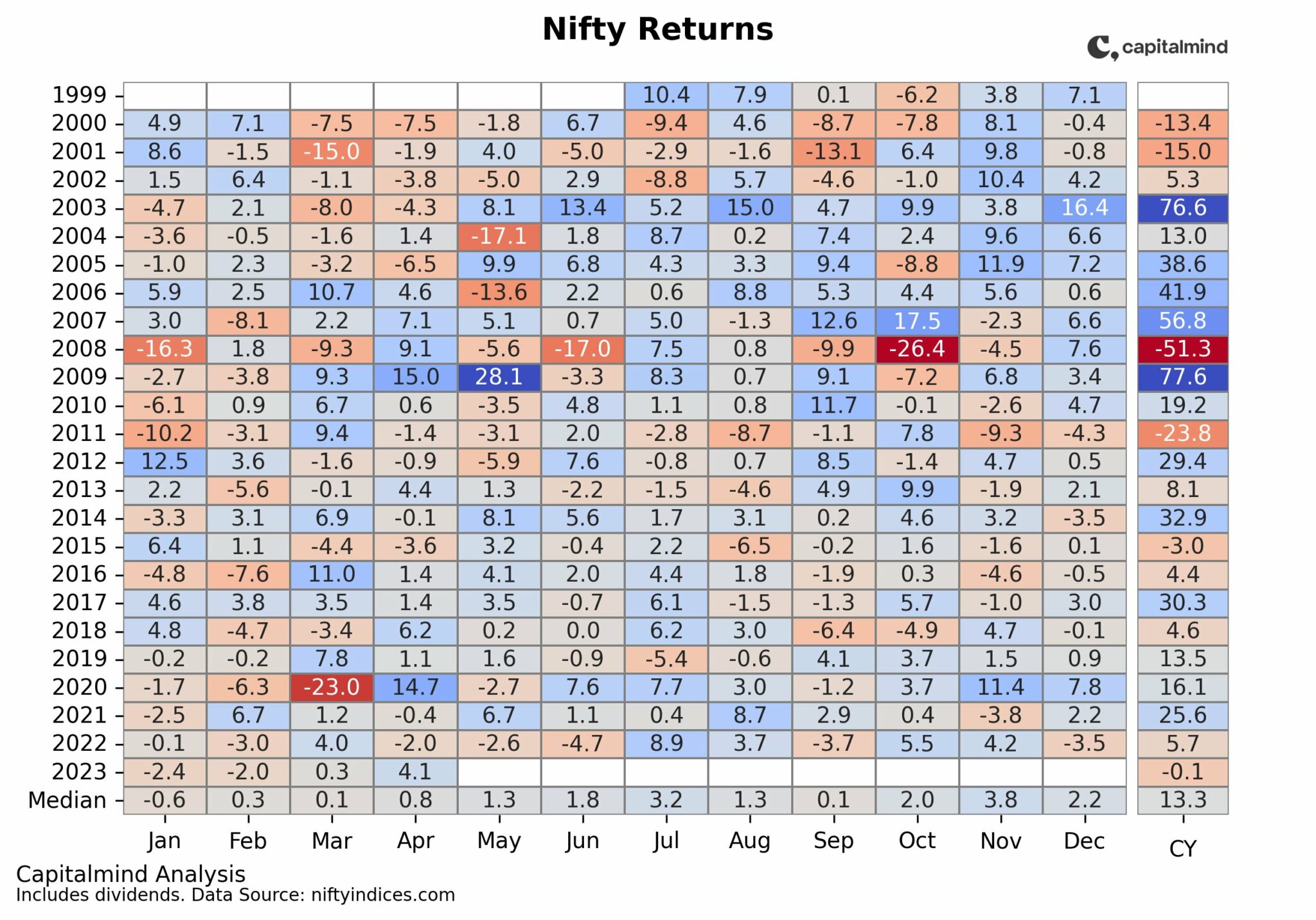
Corrections happen. A cursory look at the chart shows, from 1990 to 2020, the NIFTY has seen 10 corrections of over 20%. That is one every three years. Except, they are not equally spaced (if only markets corrected on preset schedules). In a previous post, Why March 2020 feels so bad and should you buy yet, we wrote about how corrections have become rarer since 2009 and the on-going correction of 2020, while nowhere near the worst yet, certainly has been one of the fastest.

So fast that on the sine wave chart of investor emotions that does the rounds at times like these, we were catapulted out of anxiety, flew right past denial and fear, and right into despair.
So, here we are, down about 35% from the high on 14th January. A global pandemic like none of us has seen. 21 days of near-zero activity in an economy that was already struggling to grow.
Making lemonade when life hands you the ingredients is timeless advice. But slightly harder to action when the truck carrying the lemons has just burst through your living room door, smashed your furniture, run over your dog, and come to a squealing stop so close to your face that you can smell the burning rubber on the brake pads.
But as investors, we are nothing if not optimists. So, what next?
How about figuring out what we should buy when normal service resumes, which will probably take a few weeks, more likely months. Note that we’re not implying this correction is done.
What would you buy if you were entering the markets after the correction for the medium-to-long term?
Would you buy the stocks that had done the best leading up to the previous high of Jan 14th and count on them to bounce back the hardest?
They must’ve done well because they have great prospects and a few months of a virus-induced shutdown should not change that.
“But look what happened to DLF in 2008”
Would you look for stocks that have fallen the least in the ensuing carnage implying the market thinks those businesses will suffer the least?
People won’t flock to cruises and resorts for a while but they won’t stop brushing their teeth or consuming their favourite instant noodles among other things.
“But consumer staples never bounce hard, do they?”
How about the opposite view. Stocks that had done poorly leading up to the correction, and have fallen even further?
Surely the pessimism in those is overdone and the businesses are due for reversion to the mean?
“Do we really need more reminders about DHFL and Vodafone Idea?”
Maybe you don’t care about prices at all, and just buy strong franchises delivering high ROI and reasonable growth, counting on the markets to have made them more affordable.
“Wait, is it a coincidence that these stocks also happen to have done the best leading up to the correction?”
Note how each of those separate narratives makes sense. Which brings you back to square one. It’s not like you have $128 Billion waiting to be deployed. You have to choose.
Past Corrections
We don’t have centuries of data to look back to decipher patterns in how corrections play out. Plus the further back we go, the sketchier the data becomes. So we try to make do with the handful of corrections that we do have access to.
How we analyzed past corrections:
Started with the universe of active stocks leading up to the correction. Divided this universe into deciles based on their past one-year performance. So for the March 2015 correction, we took the universe as of Jan 2015 and their returns from Jan 2014 to Jan 2015.
Our hypothesis: There is a difference in how stocks in the top deciles behave versus stocks in the bottom deciles when corrections hit. Also, how stocks do during corrections has a bearing on how they recover after the correction.
For each decile of pre-correction performance, we tracked how they fared a) through the correction itself (Jan 2015 to Jan 2016) and b) through the recovery (Jan 2016 to Jan 2017)
In order to be able to form broad guidelines instead of very specific but unusable insights, we didn’t modify timeframes to match actual corrections but looked at one-year windows before, during, and after.
Turns out, there are two more or less distinct patterns in how stocks behave during and after corrections.
Pattern 1: Just a speedbump, nothing to see here. Move on…
Mar 2015 (-23%), Jan 2011 (-27%), Dec 2003 (-23%), Aug 1997 (-33%)
Here’s the chart for the 2011 correction. Let’s make sure we understand what the chart shows.

We classified the universe of stocks into deciles based on their performance in 2010 (before the correction). The navy blue bars you see are average 2010 return from each decile. Starting from the 1st (worst) decile, each subsequent decile shows better performance, with the 10th decile being the best. Nothing dramatic there, we classified them like that.
The next two bars, show the average return for those same stocks, in 2011 and 2012. i.e. Look at the bars on the extreme left of the chart. These worst-performing stocks in 2010 returned -44% on average. Which is why they are in the worst decile. Those same stocks then did -56% in 2011 (the year of the correction), and then +16% in 2012 (the year of the recovery).
In comparison, the best stocks from 2010 (10th decile), having returned +123% in 2010, only corrected -28% in 2011 (compared to -44% for the 1st decile), and then gained +33% in 2012 (compared to just +16% for the 1st decile)
Chart shows CAGR by 2010 decile over the two-year period including the correction and the recovery

In short, the best-performing stocks leading into the correction, not only corrected the least during the correction, they then did pretty well in the recovery as well.
Here’s the same chart for the 2004 “correction”. This time without the pre-correction year returns (since you now know they increase from left to right).

What correction? After the 23% fall in the middle of the year, stocks recovered and continued on their merry way (see NIFTY chart at the beginning of the post), which is why the 2004 returns are positive in a year when they corrected.

But notice the underlying pattern. The best performing pre-correction stocks did pretty well in the correction year and the year after relative to the worst-performing stocks.
Pattern 2: Holy crap the world is ending. Shut down the markets! Oh, wait…
Jan 2008 (-56%), Feb 2000 (-45%), Feb 1994 (-40%), March 1992 (-52%)
Here’s the chart for 2008-2009.

Notice all stocks declined more or less in tandem in 2008, between -55% and -65%. Also that our stars of 2007 declined more than the duds of 2007. This is the opposite of the earlier pattern.
Here’s the CAGR chart for the two years (2008 – 2009)

The same charts for the 2000 dot-com collapse which spanned three years.
 Such a depressing time to be an equity investor. Markets fell sharply for two consecutive years. The 3rd year was relatively better but not for all stocks. The worst performers from 1999 started recovering sooner.
 Overall annualized returns from 2000 to 2003 show very little to choose from between the best and worst performers from before the crash.
Our conclusion
We only have limited corrections to go back to. But if we were to conclude based on these:
In bull market corrections (by that we mean corrections of and under 30% without other exogenous shocks, the on-going set of strong stocks tend to weather the storm better and also come out strong on the other side.
But when systemic issues slam into the markets causing losses around the 50% mark, regime changes seem to occur. Sectors and stocks that were leading the charge going in get battered the most, as expectations get revised drastically. Markets then seem to rediscover the value in the most beaten-down stocks that then go on to enjoy a period of relative outperformance.
The current situation is no bull-market correction. There are things happening that have never happened before. Central Banks are responding like, well, like they have since 2008.
Here’s how the NIFTY Indices have done and their corresponding deciles. The deciles tell you where the index falls in the universe of stocks, etfs and indices. interestingly, any stock with non-negative returns automatically falls in the 10th (strongest) decile for the past year.

If the current correction becomes a full-blown crash, the indices at the bottom of that table above are better positioned to make the most of the recovery. (If some of those index names seem unfamiliar, take a look here: NIFTY Strategy Indices)
Here’s the list of strongest performers based on 1 year returns as of March 25th. Note the presence of the Gold ETFs.

Will these come out the strongest on the other side?