Last month, equity mutual fund inflows hit an 8-month high at Rs. 12,622 Crore. AMFI’s #MutualFundsSahiHai campaign is omnipresent, helping retail participation via systematic investment plans becoming ever more popular. The recurring theme in AFMI’s commercials – “long term mein mutual funds sahi hai”. Chalo maan liya. But with over 300 funds to choose from, which ones are “sahi” for the long term?
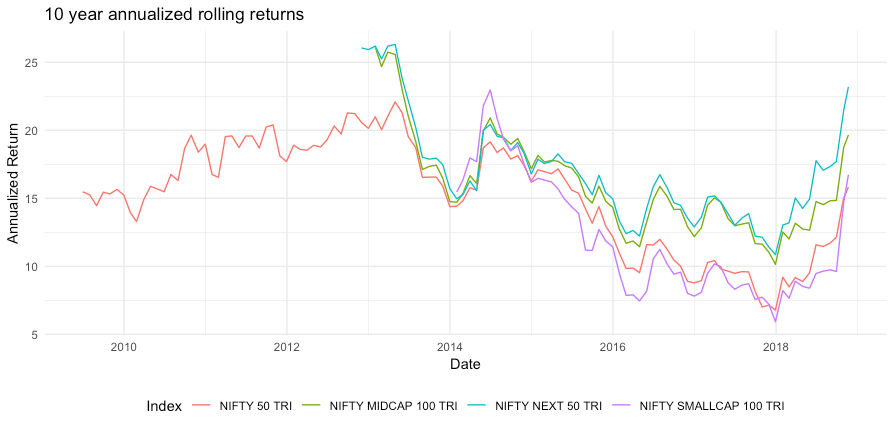
One way to start figuring it out is to look at rolling returns. Since we’re talking about the long term here, let us consider 10 year annualised rolling returns of the four most popular NIFTY indices (including dividends):
- Nifty 50 TRI
- Nifty Next 50 TRI
- Nifty Midcap 100 TRI
- Nifty Smallcap 100 TRI
TRI = Total Returns Index, where dividends are reinvested.
Wait, the Nifty’s at the same level as January, so how come the graph’s pointing up?
10 year returns will be high if the exact point 10 years ago was a local minimum (a low) versus when it was a high. So, while the markets made new highs in Jan 2018, the 10 year rolling return looks low because 10 years ago, in Jan 2008, the markets were also at an all time high. In November 2018, 10 year returns are a new high because in November 2008, 10 years ago, the market had fallen over 50% from the Jan Levels.
How To Build This Graph?
This graph is a point in time. But if you looked at this a month later, it would be outdated.
Can you build this on your own?
If you’re technically inclined, you can.
Introducing Capitalmind’s Gear Up!
Life is too short to not keep learning. As part of our process, we’d like to help educate you on the tools and technologies you can use to get data and crunch and visualize it in different ways. Here’s how you could build the above graph by yourself, starting from the basics:
- Installing R and R Studio (free, open source tools)
- Downloading data through code written in R
- Massaging that data to make for the rolling returns visualization and graph.
Have fun!
Tutorial 1 – Setting up R and R Studio
Tutorial 2 – Calculating Rolling Returns
We’ll have more on this front, and hope this helps!