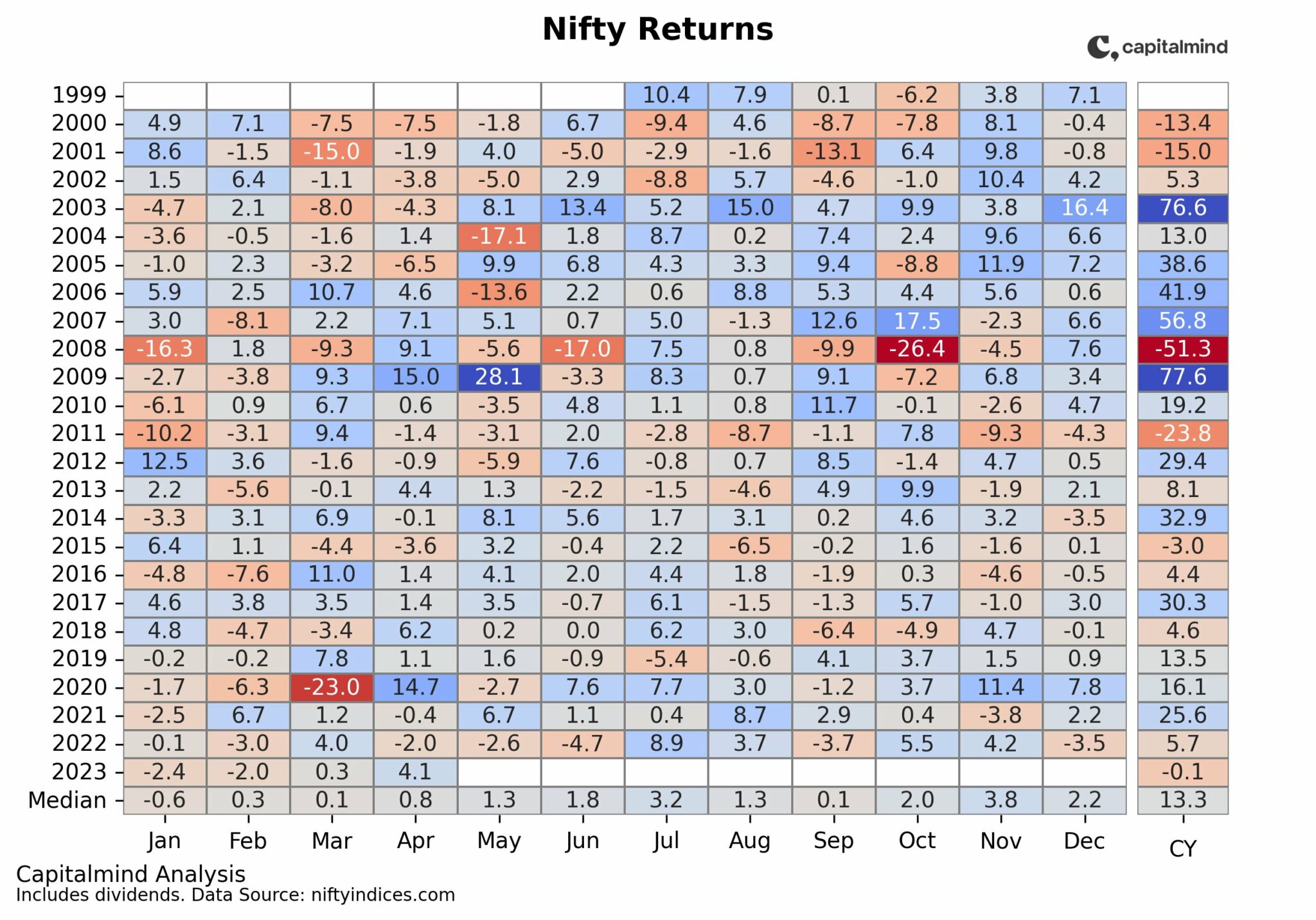
This year has been horrible, you think. It has, indeed, been a rough year for stocks. But on the index, volatility isn’t exactly very high, because:

Thanks to Kiran for the motivation for this chart!
As you can see, we have only seen about 4 days in which the Nifty was down 2% (and one day it was up 2%) in 2018. In fact, the only years that come close are 2014 and 2017.
And if you’re thinking of 2008, don’t. Because it was so bad by October you wanted a 2% day just to feel sane.

And looking a little further – a 4% down week – again, there we’ve been relatively sparse in 2018 with just two such weeks (one was the week previous to this post).

It’s been a rough year no doubt, but for the index investor it’s probably not felt quite so bad. But some stocks have seen a hit so bad that they’d be out of the range on most of these charts, so obviously, your mileage will vary.
Volatility is good, in that it brings stocks to better prices. But you know the problem with volatility is simply one thing: when your favourite and expensive stock falls by half, you see all the bad news around you and keep asking yourself, what’s to say it doesn’t fall by another half?
Charts: We're Seeing Massive Volatility. Or Are We?

Like our content? Join Capitalmind Premium.
- Equity, fixed income, macro and personal finance research
- Model equity and fixed-income portfolios
- Exclusive apps, tutorials, and member community
Subscribe Now
Or start with a free-trial
Already a subscriber?
Login Now
Related Posts

Looking for the best PMS for your investments? Find Capitalmind PMS Strategies and Performance here
As a high-net-worth investor in India, you have a wide range of options when it comes to choosing a portfolio management service (PMS) to invest your money. ...

The impact of Return on Capital on Shareholder Returns
Return on Capital (ROC) is considered a critical part of the puzzle of finding quality businesses to invest for the long term. We did a longitudinal analysis ...
Quick Look: Markets in April 2023
Markets in April 2023 April was a good month for stocks across the board. Nifty was up 4% and as a result is almost even for YTD 2023 Midcaps and Smallcaps did ...