A picture is worth a thousand words
No pain, No gain
Money can’t buy happiness
Or the more contemporary:
Privacy is a myth
If you’re not paying for it, you are the product
They are insightful phrases, originally by wise and often witty people. They convey one powerful idea in a short statement that would take most people pages to describe.
Just that they have been used so often in literature and conversation as to have no more insight to offer. A test for whether something someone says is a truism is, it is either such an obviously accepted opinion that you can do nothing but respond with a non-committal “uhun”, or it’s too generic and conceptual to be implementable.
Do a few truisms related to investing come to mind? I bet your twitter follow list has a couple of habitual offenders contributors of investment truisms.
Long-Term Investing Truisms
For today we’ll park some of the more entertaining ones and examine some old-fashioned truisms about long-term investing.
- Over the long term, equities are not risky
- Timing does not matter
- When it comes to market cap, bigger is better (safer)
Hang on. Have these questions not been answered more times than they have been asked?

Like this handy interactive infographic on betterment.com that aggregates S&P 500 data from 1928 to show that historically, if you stayed invested for 10 years, the probability that you would end with less than you started is 7.1% and your median return will be 2.72x. That same probability of loss almost doubles to 12.6% if you halve the holding period to 5 years.
Similar posts abound for Indian markets, a few in the archives of my site.
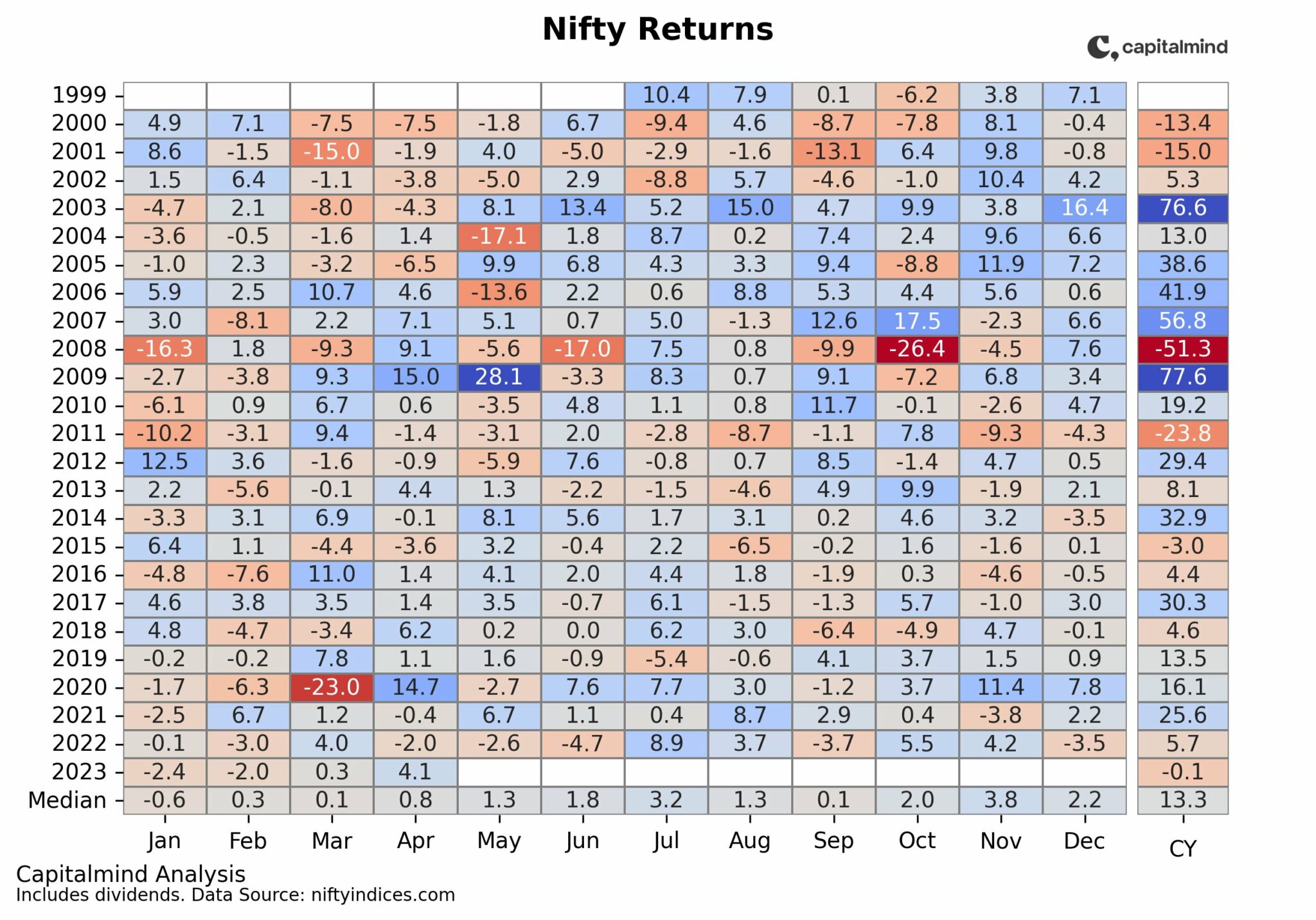
This table summarizes the relationship between how long you hold “the NIFTY” versus the probability of loss of capital, and returns (typical, best and worst-case).

Source: thecalminvestor.com
The data in this table is fine to get a detached perspective on how Indian markets have behaved.
As an investment practitioner though, only seeing aggregated index-level data feels like how a Formula 1 race fan would feel if she had missed the race, asked you about what happened, and you told her “So, median speed of the race was 375 kph, the slowest was 355 kph and the fastest car drove at 392 kph.”
Not only uninsightful, but also not representative of what happened.
Expanding the universe
So, instead of limiting ourselves to conveniently available but aggregated metrics of index returns of the Sensex, NIFTY or NSE 500, I considered the bulk of listed companies over the recent past.

Think of each years’ companies as the cohort of investment options in that year to see how they did. The increase in number of companies in each cohort are the new listings that year. These cohorts therefore represent more of the Indian public equities market than indices that are limited to the largest 50 to 500 companies by market cap.
For each cohort, I tracked performance from the starting year to the present (June 2018).
Why up to 2013 only? Taking 5 years (2013 – 2018) as the shortest timespan to qualify as “long term”.

Overall, the performance of the broad market cohorts are in line with the benchmark indices. It’s when you go a level or two deeper that some interesting trends emerge.
Finding 1: Over the long term, the “right” equities are not risky
Take a moment to qualify what risk should mean to a long-term investor. Forget finance textbooks and formulae with greek alphabets. Risk, in investing is not achieving your financial goal or your target return.
Loss of capital is a very real risk. Consider this chart.

How to read this chart. Each line represents the cohort of companies formed in year with its name, tracked until present day. The lines show percentage of stocks trading below their buy prices. For example, of the 1375 stocks in the 2008 cohort, 1219 (nearly 90%) were in the red one year later. Only 8% of the 2009 stocks were in the red in 2010, while 39% of the 2008 lot were still below their buy prices, two years after they had been bought.
Ten years later, 313 of the 1375 stocks from 2008 are still trading below their 2008 prices. Even for long-term portfolios, between 1 out of 7 to 1 out of 4 stocks continue to contribute negative returns.
Over 20% stocks losing value over a 5 to 10 year horizon is not an insignificant number: As an investor, either buy the index and let the index committee pick decent stocks or get your stock selection right. Anything in between is dangerous.
Finding 2: Timing might not matter, but luck does
The argument for long-term investing is based on reversion to the mean of returns over a longer time frame. Like they used to say in cricket before decision reviews, that poor umpiring decisions are just bad luck and they even out over the course of a match.

The chart shows how the various yearly market portfolios have done since inception. Note the dispersion in values at the same age in the various portfolios, especially between the 2008 and 2009 portfolios.
The other four portfolios are at roughly the same values currently in spite of initiating at different times.
Being lucky enough to avoid seeing a sharp correction immediately after a lump sum purchase might be one of the keys to market-beating returns. Luck aside, valuations matter, especially when planning to invest lump sum.
As a related side note, consider the chart comparing earnings to price growth over the last ten years.

This movement has made India one of the most expensive markets currently. One of the key reasons for my return expectations for 2018.
Finding 3: Bigger is not necessarily safer
Bigger, established companies are more likely to be dominant in their sectors, attract high quality talent and have robust governance in place, making them safer investments compared to small and mid-cap companies. Or that’s what intuition says.

The table above confirms that intuition until the logical flaw becomes apparent. If the market cap classification is applied yearly, then all the high-return micro-caps get reclassified as small caps, small caps as mid-caps and so on.
Instead we need to keep the market cap buckets constant once assigned at the beginning of the period to see how they perform.
Chart shows percentage of stocks in the red by market cap in 2008

This means 63% of “mega” cap stocks in 2008 are still below their price in 2008 – Bharti Airtel, NTPC, NMDC, DLF and Reliance Communications.
Note the abnormally low number for micro-caps (< 50 Cr starting capitalisation) implying only 2% of micro caps from 2008 are still in the red. This does not add up.
Here’s why this number looks artificially low. My starting data set is companies that still existed as of July to Dec 2017. So it’s missing all the companies that died out between 2008 and 2017 i.e. this data has survivorship bias. Since we do not have a way to easily get a list of such companies, we can only assume that a significant number of micro-caps in 2008 just faded out of existence.

Table shows how companies in each market cap bucket grew over the last 10 years. In this table, a company that was worth 30Cr in the 2008 (micro cap) stays in that row even if it’s current valuation is 5,000 Cr.
This chart shows the starting and ending market caps of the companies in the 2008 cohort

How to read this chart: The rows with valuation buckets on the left show starting (2008) valuations of the 1375 companies. The columns show the ending valuations (2018) of those same companies.
For example, of the 334 micro-caps in 2008, only 9% still remained micro caps 10 years later. 44% made the transition to the next bucket (50 – 150 Cr), 29% to 150 – 450 Cr. 1% of the microcaps even made to the 4,050 to 12,150 Cr market cap bucket (PI Industries, Symphony and Avanti Feeds) growing over 400x in the process.
The smaller caps might have higher mortality, but they also offer the potential for higher gains. Large caps seem just as susceptible to zero or negative growth depending on starting valuations.
The next time someone throws a truism at you, resort to that age-old gem of a quote:
“In God we trust, the rest bring data”
This is a guest post by Anoop Vijaykumar. Anoop writes about equity investing at thecalminvestor.com. Follow him on twitter @CalmInvestor